
The Worst Colour Choices for Small Spaces
YOU MUST AVOID THIS!
TINY HOMES
9/11/20253 min read
When decorating small spaces, the colors you select can profoundly influence the ambiance and perception of the room. While some hues can create an airy, expansive feel, others can trap you in a claustrophobic corner. Let’s explore the color pitfalls to avoid, ensuring your small sanctuary remains inviting and stylish.
The Psychological Impact of Color
Color is not merely a visual element; it deeply affects our emotions and perceptions, influencing how we feel about our surroundings. For those living in snug apartments or petite homes, it’s important to understand which colors to sidestep for a comfortable and aesthetic environment.
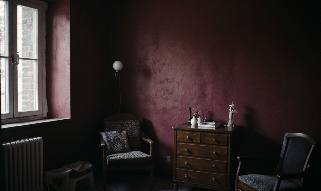
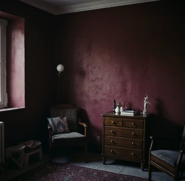
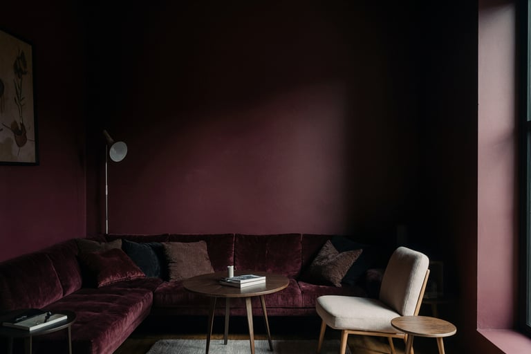
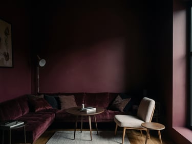
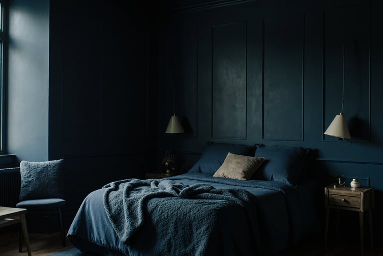
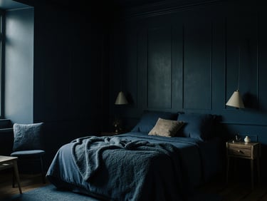
1. Dark Colors: The Dimensional Dilemma
Why to Avoid: Dark hues, like deep navy, charcoal gray, or rich burgundy tend to absorb light, creating a weighty atmosphere. In a small room, these colors can feel oppressive, transforming your cozy retreat into a shadowy enclave.
Example: Consider a small bedroom adorned in dark navy. While it may evoke a sense of intimacy, it can also leave you wondering if you’ve accidentally stepped into a maritime abyss.
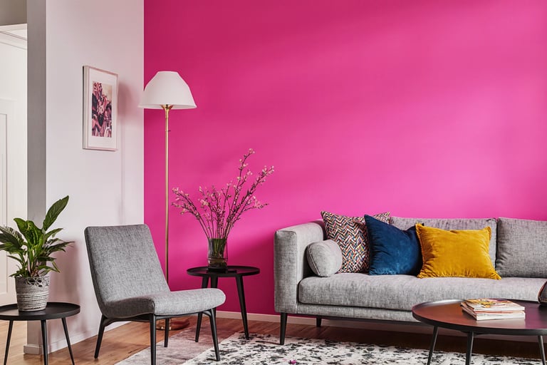
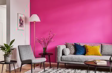
2. Overly Bright Colors: The Sensory Overload
Why to Avoid: Bold, vibrant colors can inject energy into a space, yet overly bright shades, such as neon yellow or electric pink can overwhelm the senses. They often create visual chaos, detracting from the tranquil environment we seek in smaller spaces.
Example: A neon pink accent wall may initially appear whimsical, but it can quickly turn your serene retreat into a frenetic carnival, where subtlety is lost in the raucous celebration.
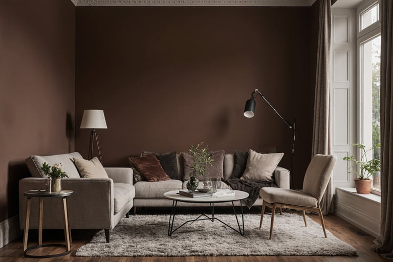
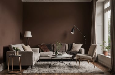
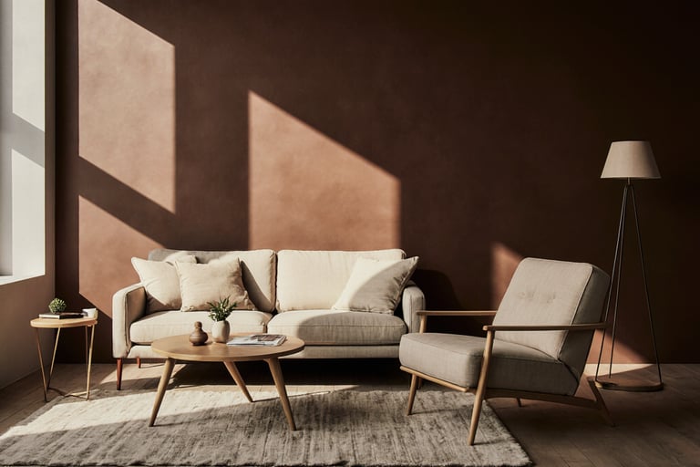
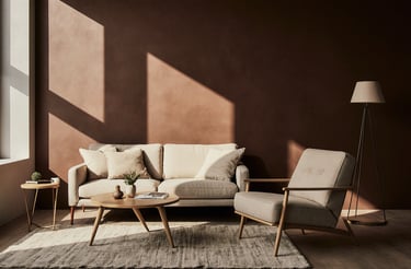
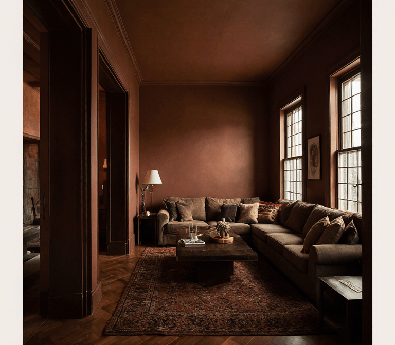
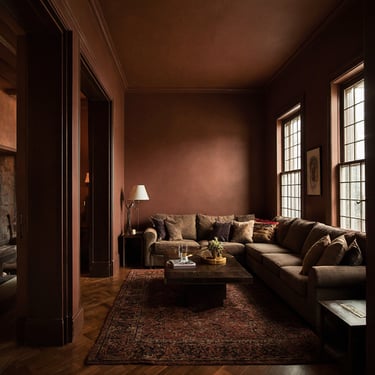
3. Heavy Earth Tones: The Weighty Presence
Why to Avoid: Deep earth tones like dark brown or burnt sienna can feel constricting and heavy. These colors absorb light and can make a small area feel even more enclosed, counteracting the goal of creating an open atmosphere.
Example: A small living room cloaked in rich brown might impart warmth, yet it can also evoke the sensation of being nestled in a chocolate box- delightful, but decidedly cramped.
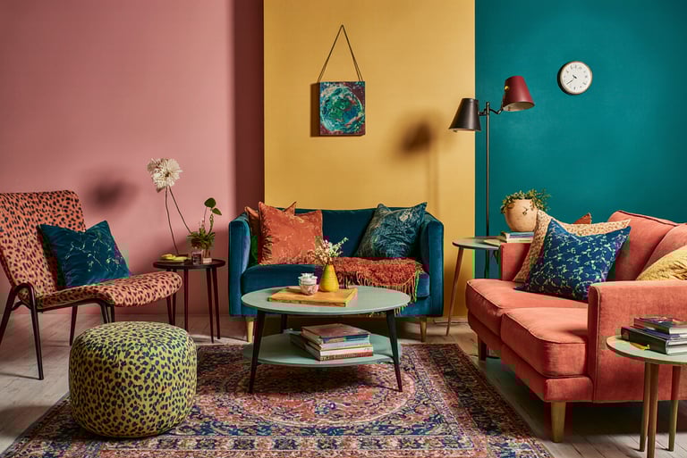
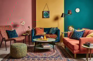
4. Excessive Contrasting Colors: The Clashing Chaos
Why to Avoid: While contrast can be visually engaging, an overabundance of competing colors can result in a disjointed appearance that feels cluttered. This visual cacophony can overwhelm the eye and diminish the sense of spaciousness.
Example: Imagine a room brimming with bold colors vying for attention. It’s akin to a family dinner where everyone speaks at once…chaotic and far from inviting.


© 2025 Style in Residence. All rights reserved.


About
The images featured on this site comprise licensed content, with certain visuals enhanced through AI assistance to enrich the reader experience and serve illustrative purposes, edited by Style in Residence.